Overview:
The project:
Create an improved website mockup based on an existing poorly designed site, elevating its accessibility.
I was asked to develop a new mockup of an existing website that has been poorly designed. My group and I were asked to find a digital or physical space and make it more accessible for the common person. I decided that it could be a good idea to redesign the Craigslist website because it hadn’t been updated since 2016. I was assigned the task as project manager so I was there to oversee any major decisions being made, help with any questions my group had, and to guide my group along the project pretty quickly seeing that we were only given two weeks to complete the project.
The problem:
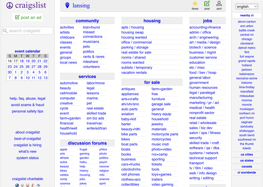
Craigslist is widely known for its usability and design problems. Its outdated layout, crowded navigation, and overwhelming number of text-based links make the site difficult for many users to navigate. Accessibility issues such as small fonts, inconsistent colors, and low contrast further impact usability. My research showed that Craigslist has not undergone a major UI update since 2012, which, along with user testing, confirmed that redesigning the platform was a strong fit for my project requirements.
Steps:
- Research websites
- Find the problem points of the website
- Look at the HTML for the website to see accessibility score
- Draw out a basic layout of what the new website could look like.
- Go into WordPress and start the basic layout
- Figure out the nav bar.
- Drawing a new logo for the front page.
- Design the mockup website in WordPress using one of the templates.
Design Process:
I began by researching poorly designed websites with clear accessibility issues and selected one that showed multiple problem points, Craigslist. Using accessibility research, an outside user test, and the POUR principles (Perceivable, Operable, Understandable, Robust), I identified key usability issues. I then reviewed the site’s HTML to evaluate its accessibility score and wrote down specific areas needing improvement. From there, I sketched a new layout in my notebook, focusing on a better navigation bar, improved images, a new logo, and a more modern look. After finishing the sketch, my group and I recreated the structure in WordPress, building out the navigation based on the site’s existing categories. To modernize the site, my group and I updated the logo, replacing the simple peace sign with a more polished design, that was created by a teammate. Finally, we created the mockup in WordPress, focusing on accessibility, a simple design that engaged with an audience, and simply making it look more like existing websites.
Reflection and Results:
What did I learn?
Some errors found were not creating a search bar and not grouping the nav bar better. I learned that most websites do need a search bar and that we don’t really think about that a ton because the search bars are always available to us in every website. They become an after thought to me while creating a website. Now I know to add one to every mock up or legitimate website I’ll design. In doing this it makes the website more accessible to those who find it difficult to navigate the website with just a nav bar. They use it to simply look up what they need, making it easier and quicker for them.
I learned how to work with a group of people in a leadership role through this project. I also learned how to keep the whole group engaged with the project especially through problem solving and rough points in the project. I did improve on my WordPress skills and HTML skills, allowing myself to see the backend development of websites and test them for basic accessibility, such as simply easily navigating a website. I also learned what should be included in a website and what people expect to see. To hone in on my leadership role, I learned the importance of communication in group work along with decision making skills.
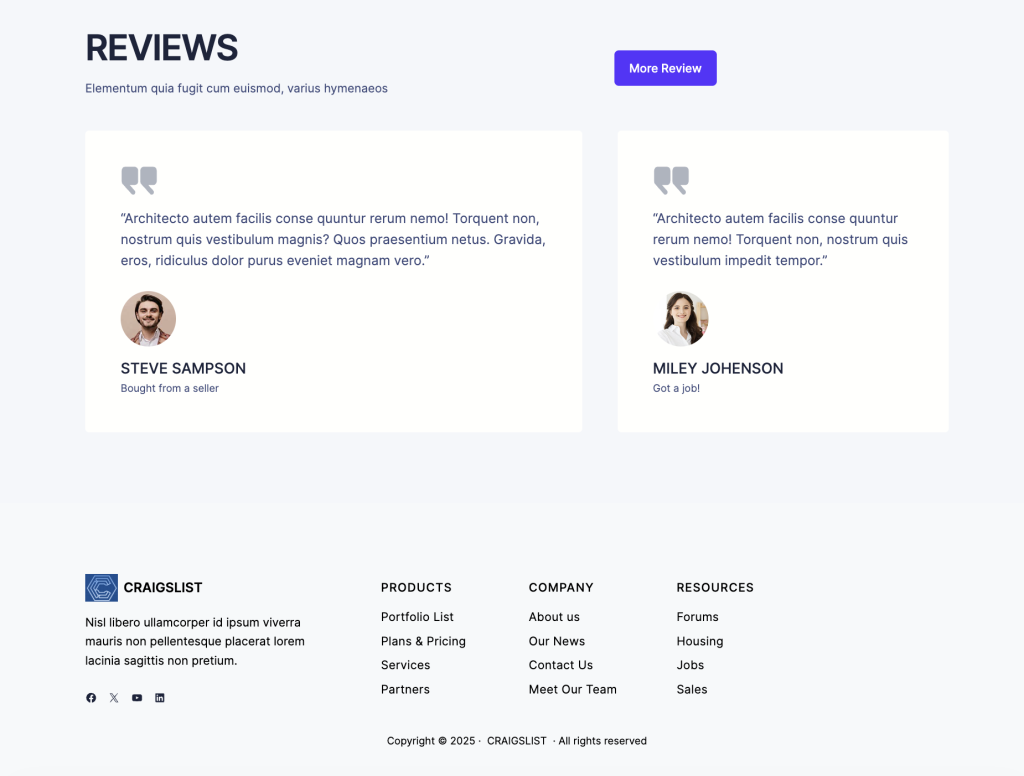
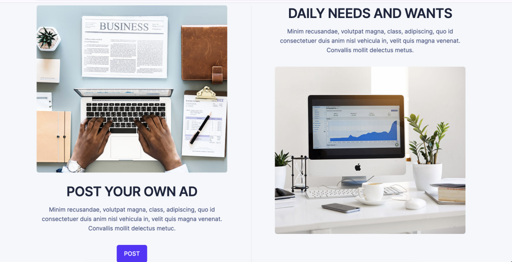
We created an improved mockup by first finding the original website’s key accessibility and usability issues, then reworking its look to be more modern and visually organized. After sketching a cleaner layout with a simplified nav bar, better images, and an updated logo, we rebuilt the design in WordPress to reflect other more popular websites standards. The result is a more accessible, user-friendly mockup that improves clarity, consistency, and overall visual appeal.
Come take a look at my website: