Overview:
The Project:
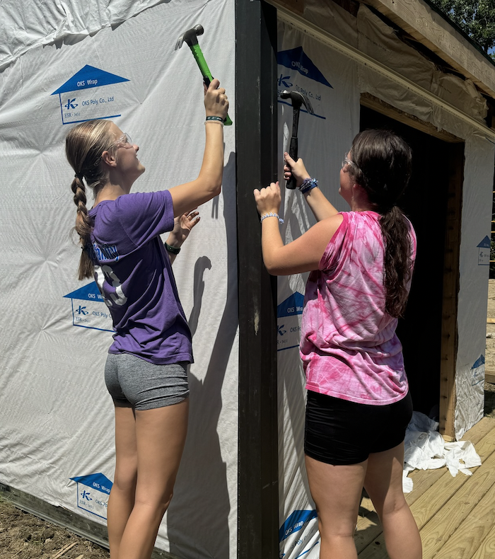
During the summer of 2024, I had the chance to volunteer with Habitat for Humanity of Genesee County in Michigan, and it ended up being one of the most meaningful experiences I’ve had. I spent time working on a variety of tasks, such as, helping build parts of a house, pulling weeds and cleaning up around the worksite, and even assisting in their ReStore, where donated items are sold to support future projects and people. Near the end of the summer, my group and I were asked to create something that could help promote volunteer engagement in the Genesee County location. After talking through a few ideas, my group and I decided to design a graphic that would clearly show the different volunteer roles available. Our goal was to make something simple and informative. This was something that would help people understand what they were signing up for and give them a better idea of the kind of help Habitat for Humanity needs.
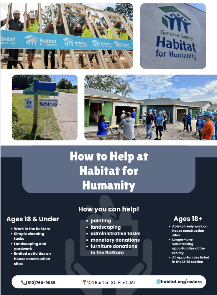
^ The Graphic Created! ^
Steps:
- Ask Habitat what they were looking for
- Brainstorm on how to accomplish the goal
- Decide what platform to create the graphic on
- Work with our supervisor on layouts
- Create the graphic with all the given information
- Finalize the graphic with our Supervisors email
- Deliver the graphic to the location
Design Process:
After talking with our supervisor about what they wanted from the project, I started researching how other Habitat for Humanity locations encouraged volunteer participation. I found banners, infographics, and long paragraphs explaining what volunteers could expect, but most of what I saw relied heavily on text instead of giving a quick overview. When I shared this with my group, we agreed that we wanted to create something clearer and more visually appealing. We chose Canva, since we all knew how to use it, and began designing a graphic that separated information for volunteers over 18 and volunteers under 18, because minors have certain restrictions. We kept Habitat for Humanity’s blue color theme to make the design feel consistent with their branding and included short, easy-to-understand descriptions of the roles available for each age group, along with a general section explaining additional ways people could help. Our goal was to create something simple, inviting, and helpful for anyone interested in getting involved.
Results and Execution:
What did I learn?
Through this process I didn’t just learn more about design or color schemes, I learned the importance of giving back. I realized how meaningful it is to support your community because, whether we like to admit it or not, there are people who are less fortunate and could use a little compassion. I learned quickly that even a small act of kindness can change someone’s entire outlook on life, whether it lasts for a moment or much longer. This experience helped me see the world differently, and it is a big part of why I am now committed to creating designs that prioritize inclusion. It showed me that compassion and thoughtful design can make it easier for someone to navigate their day-to-day life. Alongside these personal lessons, I also learned a lot about working within an established company. I gained a better understanding of how important it is to listen to a client’s ideas and expectations, because meeting their standards matters more than sticking to your own preferences. I also realized how essential communication and collaboration are, especially when working on a group project. Overall, this experience taught me lessons that reach far beyond the workplace, and they are lessons I know I will carry with me for the rest of my life.
What we delivered!
In the end, we completed the infographic and delivered it to the Habitat for Humanity ReStore, handing it directly to one of the managers who reviewed it and approved our final design. We asked that they also share it with the director of that location to ensure it met his expectations as well, since we wanted the project to fully align with what he had envisioned. He was not available at the time, so my partner and I left our contact information in case any changes were needed. Since then, we have seen the infographic displayed in their lobby and available at the front desk for volunteers to take, which was incredibly rewarding to witness. The project proved to be a genuine success, and we were proud to deliver something that met their needs and will continue to help future volunteers understand how they can get involved.